Analyzing COVID-19 data collected from a laboratory database not only helps to monitor COVID-19 positivity rates, but also guides Leadership in managing resources such as staffing, supplies and reagents. In this case, the data was extrapolated from a report built within the Discern Analytics 2.0 (DA2) application of Cerner. This particular report was designed to specify a relative date, relative count or absolute date of verified results and an order name. The data can then be exported to a specific file location and uploaded into Tableau. Within Tableau, parameters can be set to generate relevant information. This guide shows how to create a table and graph from data retrieved from DA2. (Note: The original data has been slightly modified for instructional purposes.)
PART A: Export data from DA2 in Cerner
Step 1. Specify parameters on the DA2 report.
Click on the right icons to specify the time range and orderable test.

Step 2. Export Data
Click the Export Data icon on the tool bar.

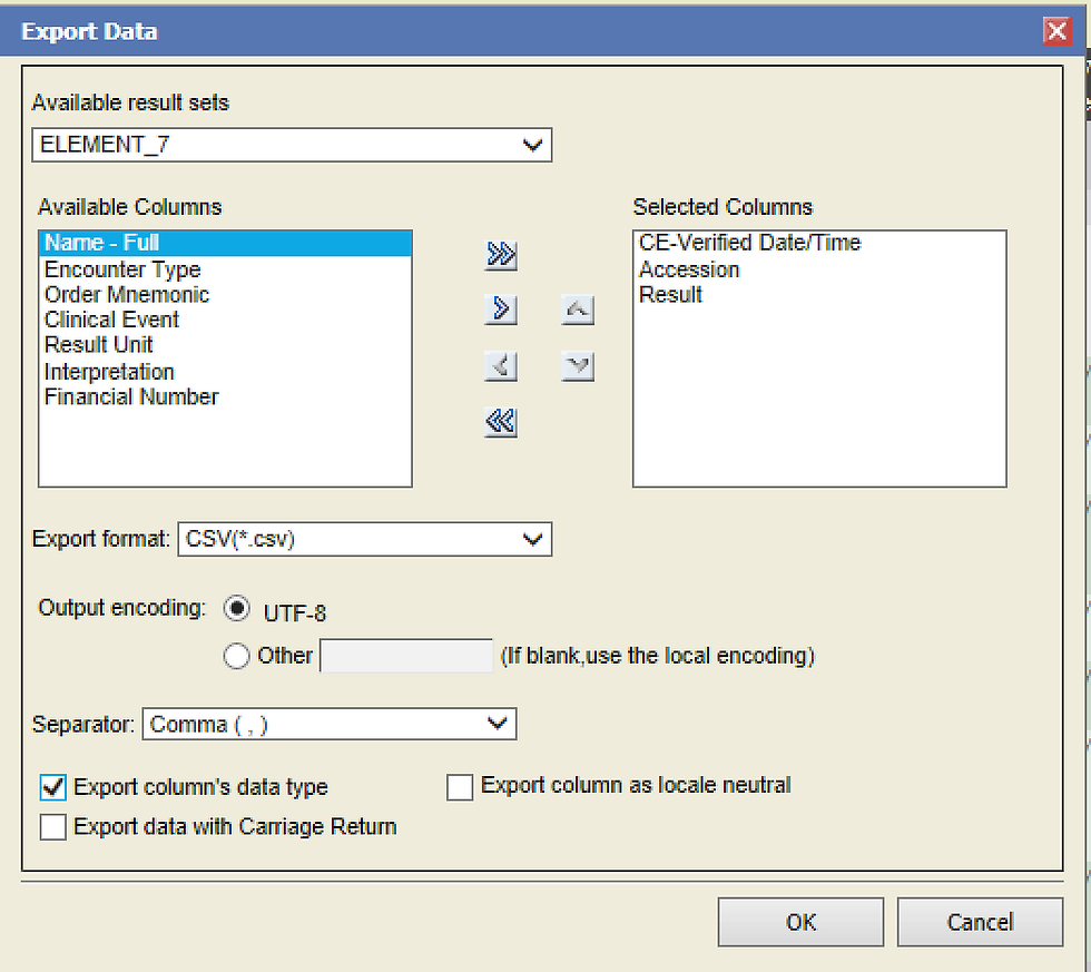
Step 3. Specify Export Data Details
a. Move names from the list of Available Columns to Selected Columns.
b. Export format is defaulted to .csv file
c. Separator is defaulted to Comma (,)
d. Click the box for “Export column’s data type”

PART B: Import Data to Tableau
Step 4. Import csv file to Tableau
a. Open Tableau and select “More…”
b. Locate file to import.

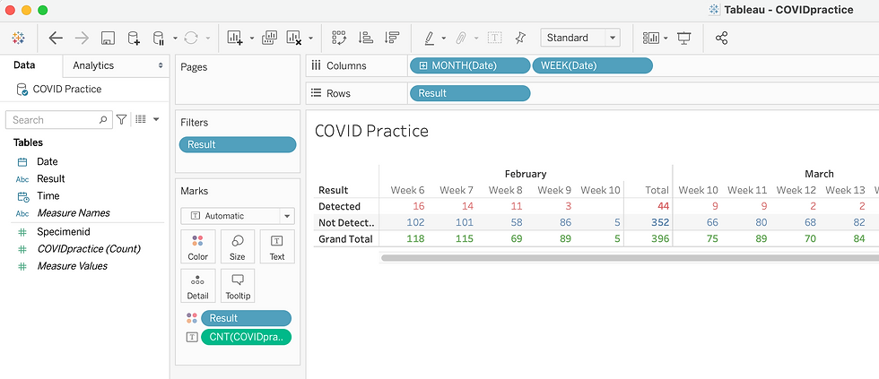
Step 5. Create Table for Weekly Totals
a. Add Filters. The Result was added to the Filters to include only certain results.
b. Add Columns. The Date was added to Columns to divide the data by Week Number and Month.
c. Add Rows. The Result was added to Rows to divide the data into Detected and Not Detected results.
d. Add Marks. The Result was added to Marks with color to designate Detected as red, Not Detected as blue and Grand Total as Green. The CNT was added to Marks with Text to display the count as a numerical value.

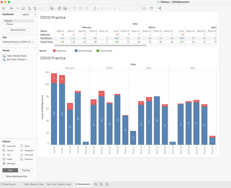
Step 6. Create Bar Chart for Weekly Totals
a. Right click on the Table tab and select Duplicate.

b. Click Show Me and then click Stacked Bars icon.

Step 7. Create Dashboard with Table and Bar Chart
a. Drag the Table and Bar Chart. Place it accordingly into the Dashboard.

Commentaires